Design notes
There is a need for a standard way of presenting contact information for a service. The Government Service Manual says that a service must set up and manage user support, including directing users to the information they want.
This pattern is specifically for offline support channels for when someone can’t continue with the online service, not in-service contextual support content.
There is an existing GOV.UK Design System pattern that gives general guidance on including contact details, but is not specific about presentation.
Design goals
- Make it easy for users to find contact information
- Be consistent with existing GOV.UK guidance
- Provide a clear recommendation for DWP services
- Work well for both simple and detailed contact information
- Be usable on a range of screen sizes
Design considerations
Content length
Using the details component reduces the amount of visible content on the page and the user is able to expose it if they require it. Placing the contact information above the footer increases the visible page length for users who may not want or require it, and it could be a barrier to other links in the footer. This likely has more impact for users on mobile devices.
Colour of links
Current GOV.UK guidelines show all footer links in black, not the blue active or purple visited colours. The blue and purple does not fail colour contrast on the grey footer background but are there other factors to think about:
- How will it fare with different levels of color blindness and dyslexia?
- Would following the current guidelines by having all the links in black make it harder for users to scan for links?
Proximity of links at mobile
Being able to scan and tap links on devices at smaller resolutions might be difficult for some users where links are in the normal document paragraph flow. Although the meta links in the GDS footer example does not address this, and the same issue would be true for links in the main content.
What we did
We reviewed current practice both within DWP and elsewhere.
The two most common positions for contact information are:
- a details component placed near (usually below) the primary button
- just before the standard page footer
We also saw a sidebar implementation but couldn't see a strong argument for standardising on this.
Context and other examples
An existing pattern in the Ministry of Justice design system requires a details component on every page of the service but leaves open the question of contact channels. It gives the option of a contact form.
The Department for Education's Get into Teaching service modified the GOV.UK footer component to include contact information.
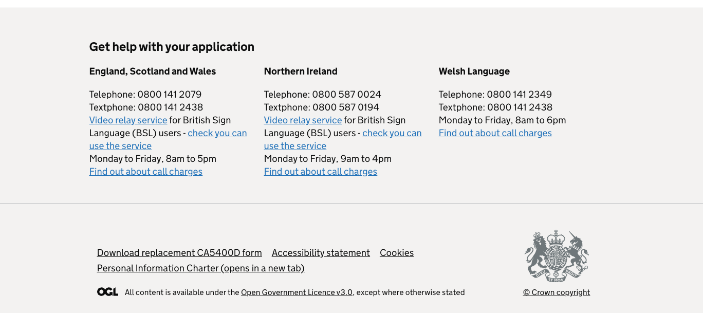
The DWP's Apply for a National Insurance number service places contact information above the service footer.
Comparing the benefits of the two options
A details component:
- is closer to the main action on the screen so may be easier to find
- uses less screen space in its default closed setting
- hides the information for those who do not need it
Information above the footer:
- keeps the details component available for immediate contextual help on individual screens, giving designers more flexibility
- makes information visible without a click
On balance we decided that the footer option as used in the DWP Apply for a National Insurance number service would be the best solution for service-wide contact information.
Apply for a NINo also places the same information on the Start page of the service below the Apply now button.
Next steps
Do we need different options for different services’ needs? For example:
- Some need to put large amounts of information on every page
- Some just need a single ‘Help’ link
- Contextual help is different again
It’s also possible to add a separate ‘Help’ page or pages within the service. How should we deal with this in the context of the pattern?
Get support
Need help implementing this in a prototype or production build? Get support from the Design System team.
Give feedback
We depend on insights from real projects to update and improve the design system. If you use something we made, tell us how it went.
Could we improve this page?
Send questions, comments or suggestions to the DWP Design System team.
Last updated: